Ozone structure of the Upper Troposphere / Lower Stratosphere
The HIRDLS satellite reveals the structure of the Upper Troposphere / Lower Stratosphere (UTLS) region by measuring ozone.
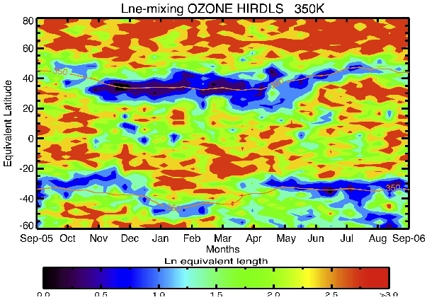
Figure 1: Logarithm of Equivalent Length (in relation to undistorted contour) as a function of equivalent latitude and time of year. Blue colors indicate low mixing, or barrier regions, while reds indicate regions of high mixing. Yellow lines are the thermal tropopause locations in both hemispheres from GMAO data. High values indicate contorted boundaries and correspondingly greater lengths over which mixing can occur.
Figure 1 shows that in the UTLS region, the region with a steep gradient in potential vorticity around the thermal tropopause forms a strong barrier to mixing from November until May in the northern hemisphere, i.e. during northern winter and transition seasons. A similar indication of winter barriers can be seen in the southern hemisphere. This is borne out by plots of ozone mixing ratios on equivalent latitudes as a function of time. There is very little change during the winter periods in the vicinity of the barrier. These results are in good agreement with results of Haynes and Shuckburg (2000).
The results in Figure 1 were obtained using HIRDLS ozone data and GMAO winds to calculate the Equivalent Length Le, as defined by Nakamura (J. Geophys. Res., 1996), on the 350K isentropic surface. Here the log of Le, normalized by the length of an undistorted contour, is plotted as a function of equivalent latitude and date during the year. The year is displayed from September 2005 to September 2006, so that northern winter is in the center of the plot. Blue indicates regions of low equivalent length, therefore barriers to mixing, while yellow’s and reds show regions of rapid mixing. The yellow line passing through the blue region shows the region of the thermal tropopause.
The plot was obtained by using HIRDLS data with a Reverse Domain Filling (RDF) code to calculate a high resolution ozone map on potential temperature surfaces in the UTLS region for each day for 2 years. (The trajectory code was provided by Prof. Ken Bowman of Texas A&M University). These high resolution maps permitted the calculation of the equivalent length, as defined by Nakamura (J. Geophys. Res., 1996).